Photo Composite and Retouch in Photoshop 101
Acknowledgement
We acknowledge Aboriginal and Torres Strait Islander peoples and their continuing connection to land and as custodians of stories for millennia. We respectfully acknowledge the land on which we all meet today, and pay our respects to elders past, present and emerging.
Summary
Have you ever wanted to retouch or edit the colours of a photo? Or add several images together into one? Learn the basics of Adobe Photoshop in this skills development workshop. Photoshop is an industry standard program for editing photos and raster graphics and for creating digital art.
101 skills development workshops give you the basic skills you need to start your new creative journey. Each workshop is delivered by an experienced facilitator and no prior experience required, just basic computer skills, a willingness to learn and a bit of patience.
Skills Introduced
- Understanding Raster Graphics
- Opening your File/Creating New Files
- Navigating the Workspace
- Layers
- Adjustment Layers
- Content Aware Fill
- Basic Masking/Making Composites
- Finishing Your Image
- Saving Your Images (File Formats)
Tools and Preparation
Software required: Adobe Photoshop.
Health & Safety
Running this workshop at The Edge?.. You should familiarise yourself and your participants with:
- DML Risk Assessment
Preparation
Before the workshop you will need to sign up for an Adobe Account so that they can sign into Adobe Creative Suite on arrival to the workshop.
Workshop Walk through
Understanding Raster Graphics
On the left, you can see a raster graphic. On the right is a vector. You are likely very familiar with raster images already - if you've ever taken a photograph on your phone, you've produced a raster image!
 |  |
| Raster/Bitmap | Vector |
| A raster image (for example a photo taken on a digital camera) is made up of thousands of little squares of colour called pixels. If you take a raster image and stretch it to be larger than its original size it will 'pixelate' and lose quality. | Whereas in vectors we can make our image as big or small as we like and it will never lose the crisp lines, this is because vectors are not made of pixels, instead they are made up of lines described by mathematical equations (thankfully we don't need to know the maths, the computer works that out for us!). |
Because we are using Photoshop for photo manipulation today, we will be working with raster graphics.
Image Resolution
Because raster graphics are constrained by the pixel information within them, it is best to work with the highest quality image possible when doing editing - you can always scale down, but scaling up is not possible without quality loss.
Standard image resolutions are:
- For Screen: 72 dpi
- For Standard Print: 300 dpi
- For High Quality Print: 600 dpi
- For Very High Quality Print and Small Text: 1200 dpi
DPI stands for 'Dots per Inch'. Sometimes PPI (Pixels Per Inch) is used instead.
Colour Modes
There are two colour modes we will typically use for images:
- RGB (Red, Green, Blue) - an additive colour mode for images intended to be displayed on a screen or reproduced with light.
- CMYK (Cyan, Magenta, Yellow, Black) - a subtractive colour mode for images intended for printing with ink or replicated with pigment.
RGB is typically more vibrant than CMYK, as it is produced with light rather than pigment. It is possible to convert an image file from one colour mode to the other, however it is advisable to design using the correct colour mode from the outset if possible.
Opening your File/Creating New Files
Let's start with downloading the source images we'll use today:
When they open in a new window, simply right-click and save them to your computer.
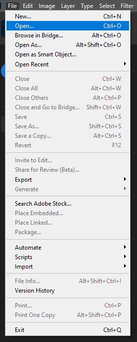
To open them in Photoshop, go to 'File', and 'Open'.
Select your files to open them. You can open both at once by selecting the first, then holding down the 'CTRL' key as you click the other files you wish to open.
If you were creating a new file from scratch, you could go to 'File' and click 'New', then select from the variety of presets available or choose a custom option.
Navigating the Workspace
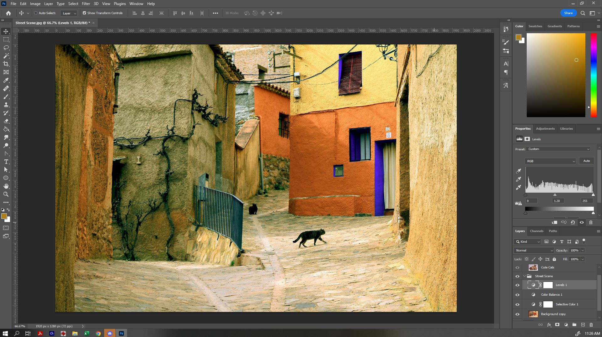
Now that we have our files open, let's have a look at our workspace:
- The Menu Bar shows the File, Edit, Image, and other menus that give you access to a variety of commands, adjustments, and panels.
- The Options bar (beneath the menu bar) displays a range of options for the tool you are currently working with. When you change tools, the options here will change.
- The Tools panel (on the left) contains tools for editing images and creating artwork. Some tools show a small triangle in the bottom right-hand corner - this indicates that related tools are hidden underneath what is currently shown. To access related tools in a group by clicking and holding a tool in the panel.
- Panels (on the right) include Color, Layers, Properties, and other panels that contain controls for working with images. You can find the full list of panels under the Window menu, but today we'll primarily be working with 'Layers' and 'Properties'.
- The Document Window (in the middle) displays the file you’re currently working on. Multiple open documents show up in tabs in the Document window. If you want, you can click and drag on a tab to separate it, so that you can view more than one document at the same time.
Layers
After opening Street_Scene.jpg, it should now be visible in the Document Window. On the lower right-hand side, you should see the Layers panel. If you cannot see the Layers panel, you can open it by going to 'Window' in the Toolbar, and selecting 'Layers'
By default, when opening any file, the only layer you will see is a 'Background' layer.
It is generally good practice to maintain an original of any file that you're working on, so we're going to duplicate the background layer to create a copy to work on. To do so, right click the Background layer, and select 'Duplicate Layer'.
You can choose to give your duplicate layer a different name at this point - by default, it will just say 'Background copy'. Naming your layers is a great way to keep organised!
To delete a layer, simply right-click the name of the layer and select 'Delete Layer', or click the bin icon in the bottom right-hand corner.
Importing Layers
To bring other layers into your file, you have a couple of options:
- Go to 'File' and select either 'Place Embedded' or 'Place Linked', and select the image you want to become a new layer. (Generally we'll use 'Place Embedded', as your file won't be altered if the original changes or is moved to a different location on your computer.)
- Open the image you want to import in Photoshop, drag the tab out so that it has its own document window, then simply drag the layer from one file to the other and it will place it as an embedded file.
Once we have dragged the additional layer into our file, we can rename it by double-clicking the name of the layer.
Layer Organisation
- To turn on and off layer visibility, click the eye symbol beside the layer.
- To change the order of layers, click and drag the layer up and down - layers at the top will sit over layers on the bottom.
- To organise layers into groups, click the folder symbol at the bottom of the layers panel to create a new folder. You can then drag layers into that folder. Organising your layers this way can be very helpful, as folders allow you to affect multiple layers at once, and can help you navigate between layers easily with very complicated images.
For now, let's make our Cats folder invisible, so that we can work on our Street Scene first.
Hot Tip: When creating a new layer or adjustment layer, it will appear immediately above the one you currently have selected in the Layers panel.
Adjustment Layers
Adjustment layers allow you to make nondestructive adjustments to the colors and tones to the layers beneath it, without permanently changing the pixels in the image. Adjustment layers can be altered at any time without causing a permanent change to the layers underneath them.
To access adjustment layers, click the circle at the bottom of the Layers panel, and select the adjustment layer you'd like to use.
Some adjustment layers to note are:
- Brightness/Contrast: simple adjustments to brightness and contrast.
- Levels: adjusts the tonal range and colour balance of your image - it has more fine-tuned control than Brightness/Contrast.
- Curves: where Levels adjusts the tones/colour balance globally, Curves gives you even more fine-tuned control.
- Vibrance: allows you to boost duller colours - it only affects the less saturated parts of the image, while leaving the already-saturated areas as they are.
- Hue/Saturation: changes the overall colour of your image. 'Hue' changes the colour, and 'Saturation' changes the intensity of the colour.
- Colour Balance: changes the overall mixture of colours in the image - works very well for colour correction.
- Selective Colour: allows you to remap colours - eg, changing reds to yellow, or blue to purple.
When you select any of these adjustment layers, a 'Properties' panel will appear, allowing you to fine-tune your adjustment. Eg, here I've used 'Selective Colour' to alter the Blue doorways and windows to be purple instead:
I can continue this process and adjust other colours, or add additional adjustment layers to alter other aspects of the image.
Just some simple adjustment layers can make a real difference to an image - from simply correcting white-balance to changing the entire mood of an image. Experiment until you have a result that you like - remember, we can always come back and alter these adjustment layers later, too!
Content Aware Fill
Photoshop has a range of tools that can make editing images a lot easier than it used to be - one of those is Content Aware Fill. Let's remove the cats currently in the photo using this tool.
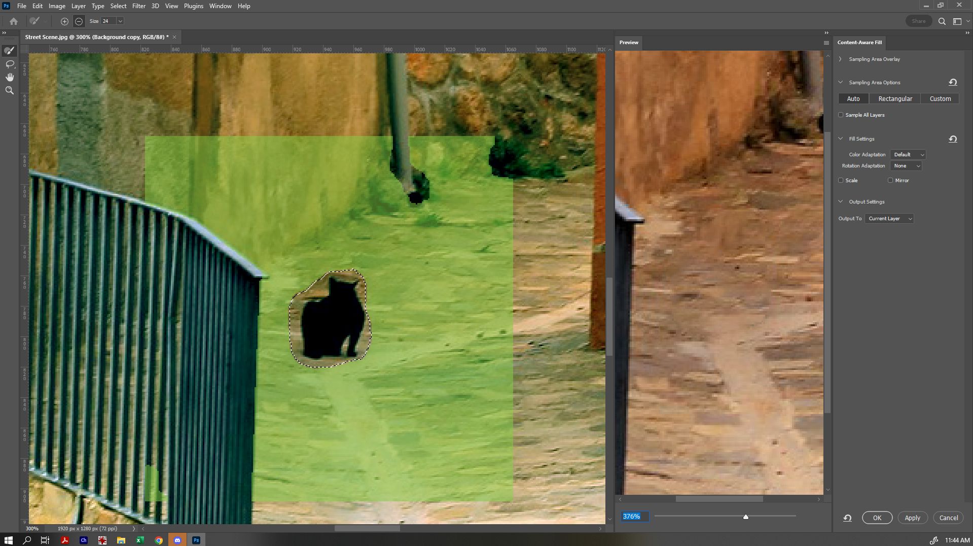
First, ensure that the 'Background copy' layer is selected. You can zoom in close to make this easier with the Zoom Tool. Then, use the 'Lasso' tool to draw around the first cat, so that it selects that portion of the image for you, then go to 'Edit' and select 'Content Aware Fill'.
Doing so will bring up the Content Aware Fill options. From there, you can see a preview of the finished result, see an overlay of where the artificial intelligence is using to fill the area as shown by the green overlay (you can adjust this with the selection tool at top left) and change other fill settings. Experiment until you've found a fill that you think works best, and since we've already got a back-up of our original, we can select for it to output to the current layer.
You can see here that I deselected some of the areas that weren't of the correct texture, so that the artificial intelligence has a better idea of the texture we're trying to replicate. Holding down 'Alt' will allow you to switch back and forth between adding and erasing (as indicated by the + or -).
Once you're ready, select 'OK'.
Next, we can do the same with the other cat. You can see by default on mine that the filled area is pretty noticeable to begin with:
But then when we go back and refine the area it's referencing, it becomes for more seamless:
Click OK when done. If we wanted to, we can do some additional adjustment with tools such as the healing tool, patch tool, and clone stamp, but for today, we'll leave it at that.
Try turning on and off the visibility of your Street Scene group to see how it compares to the original!
Basic Masking/Making Composites
We've created a nice base now for our composite image. In general, when deciding on images to composite together, there are a few things to keep in account:
- Are your images of a comparable resolution?
- Are your images of a comparable level of detail?
- Is the lighting suitable across your various components? (Eg, will the light-source look consistent when they are put together?)
If you're going for a more stylistic/obviously photoshopped look, these questions may not be as much of a concern - however if you're aiming for something more photorealistic, they're something to keep in mind. Today. we're not looking for a flawlessly realistic look.
Let's take the cats we popped in the file earlier and add them to our new background. Turn on your 'Cute Cats' group, so that we can see the other image we chose for this project. We'll use the 'Quick Select' tool to paint over the areas we want to select (in this case, our cats). Remember, if you need to access a tool underneath another tool, just click and hold to show the hidden tools.
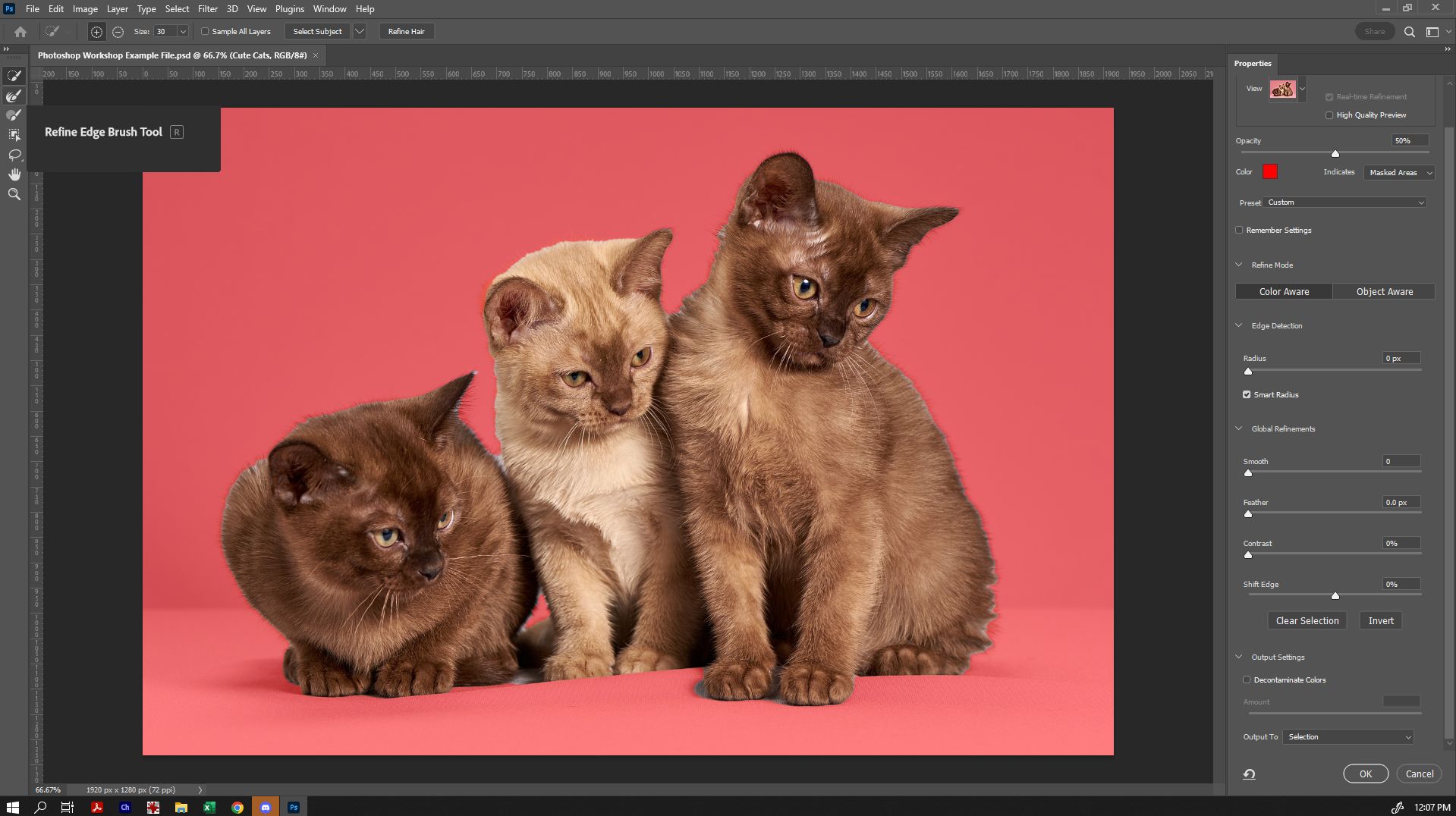
In the toolbar, click 'Select Subject' and the program will create an automatic selection around the main subject of the image. If we need to refine that further, we can also use the quick select tool to add or remove (holding down ALT to switch between these) areas. Don't worry - it doesn't have to be perfect.
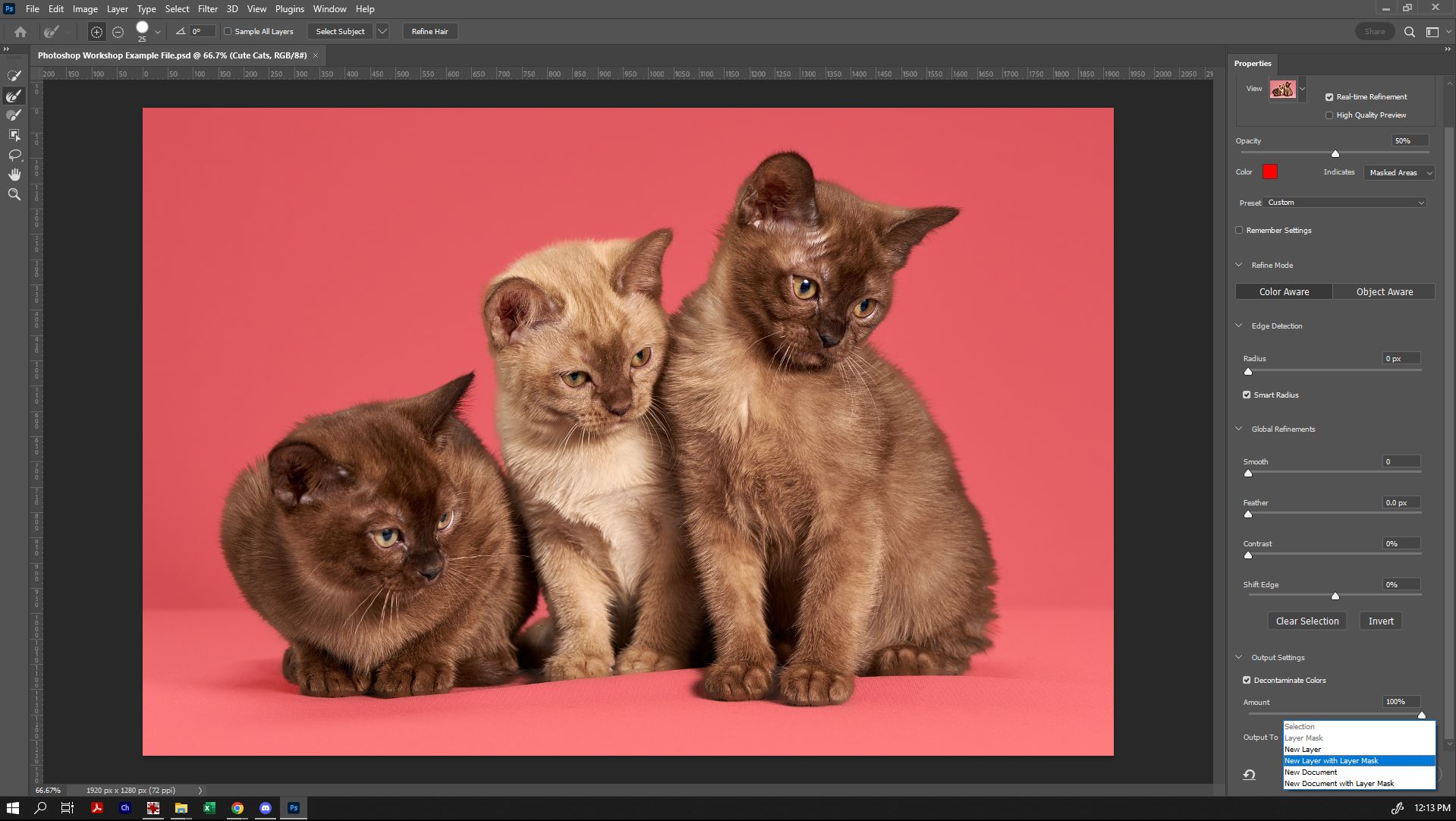
From there, click 'Select and Mask'. From here, we can refine our edge using the 'Refine Edge' tool (second one down) and select all those little hairs so that everything comes up perfectly.
With the Refine Edge tool selected, paint around the edge of the cats, barely overlapping where the hairs are, for the cleanest look. You can also select 'Decontaminate Colours' - this tells the program to try to remove any of the background colour that it can still see there too. You can switch between view modes to see the results of your edge refinement more clearly, if needed.
Very importantly, we are going to choose to output to 'New Layer with Layer Mask'. This does two things: preserves a copy of the original underneath, and gives us a very useful mask with which to make adjustments to the cats only later also.
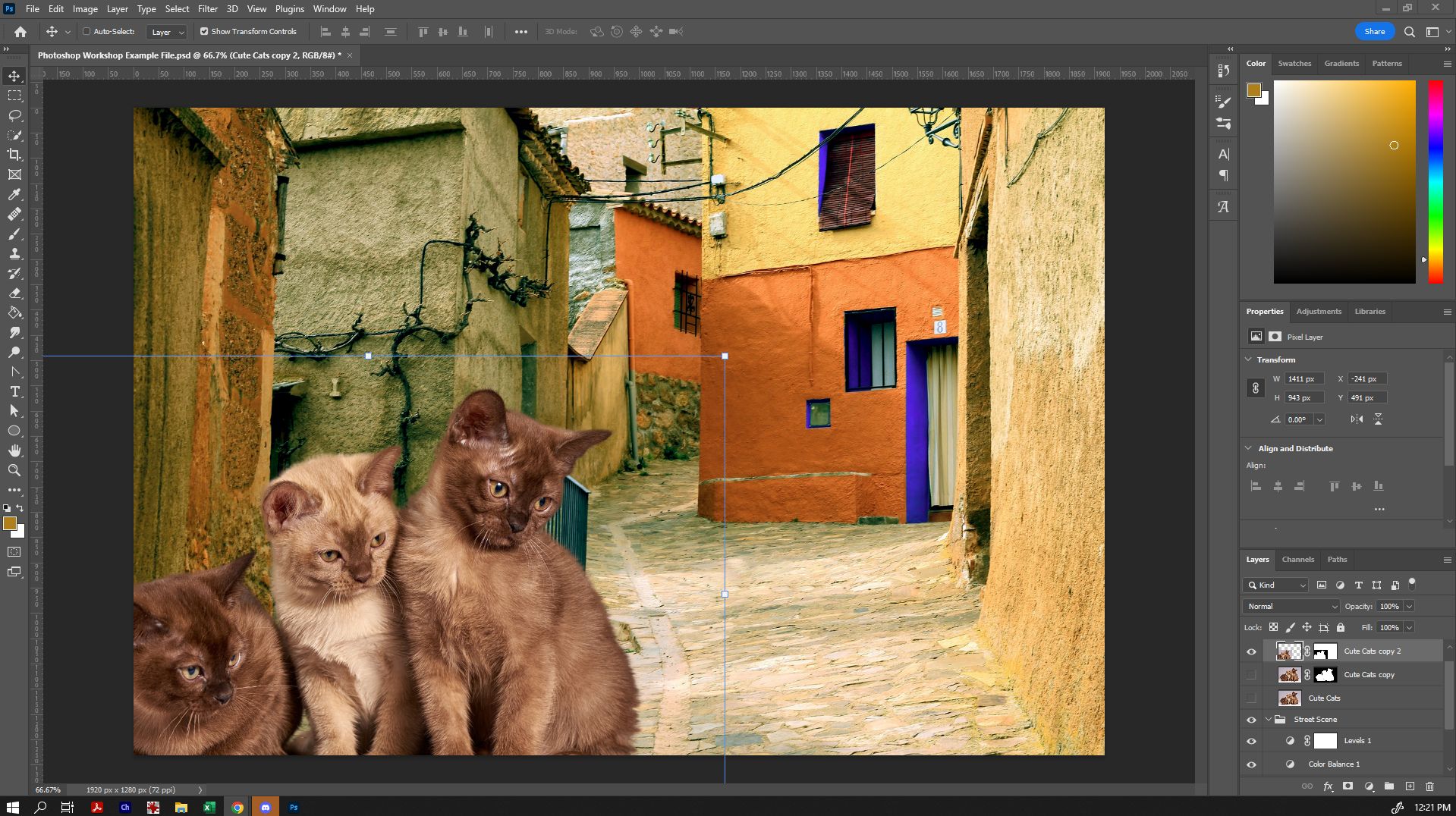
Now that we have our cats on a new layer with a layer mask, let's duplicate that layer (the reason we are duplicating it is because if we want to go back to the original masked layer at its current size, we can) and hide the original.
Now we can, using the Move tool, select the corner of the bounding box and drag to make them smaller, and move them to a different part of the scene. (If you cannot see a box around the cats, make sure that 'Show Transform Controls' is selected in the Options bar).
Because our cats did not have perfectly showing paws, I'm going to overlap them slightly with the edge of the canvas (and because I like the idea of giant cats, I'm going to leave them proportionally large). When you're happy with the scale and location, click 'Enter' to lock the scale in place.
Technically, we could stop there - but we can, if we want, take it one step further.
Finishing Your Image
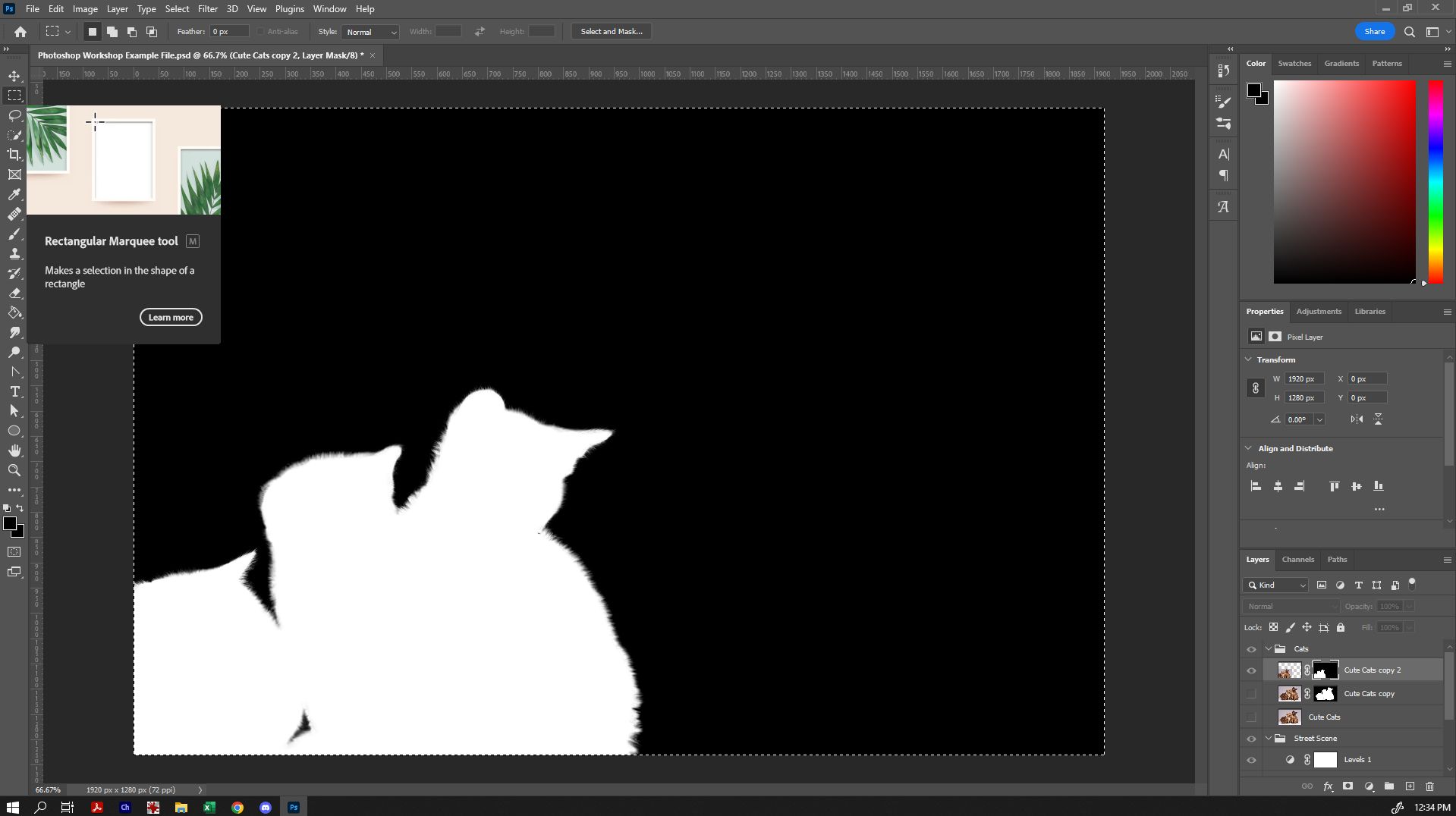
You will notice that the mask on your smaller cats layer now has a lot of white around where the original borders of that image are. In masks, where there is white, we can see - where there is black, it will not show. Let's make it so that the mask is covering the rest of the area, because we'll use this mask for additional adjustment layers.
To select the mask, hold down 'Alt' as you select the mask area of your layer. This will let you easily see what the mask is and isn't showing.
Paint in the remaining white area around the cats with black using the paintbrush tool (or a combination of the fill and paintbrush tool).
From here, we can do something very cool: we can copy that mask, and put it on the folder, so that anything we put in that folder will only affect the cats. To do so, use the rectangular marquee and drag it over the mask, and then copy (ctrl-c, or 'Edit' and then 'Copy').
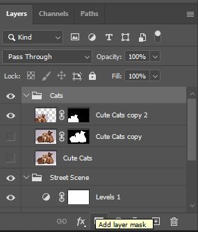
Alt-click the mask again, so that we exit the mask mode. Then select the 'Cats' folder we made earlier, and click the rectangle in the bottom of the layers panel to create a layer mask on the folder.
Then we can enter the mask we just made (Alt click the mask layer), and paste the mask from earlier (ctrl-V, or 'Edit' then 'Paste').
Alt-click the mask layer to view everything properly again.
Now anything you put in the cats folder (including adjustment layers!) will now only apply to the cats! This allows you to refine them further to blend into the scene more seamlessly - eg, you might want to adjust their contrast or colours to more suitably (or unsuitably) match the scene.
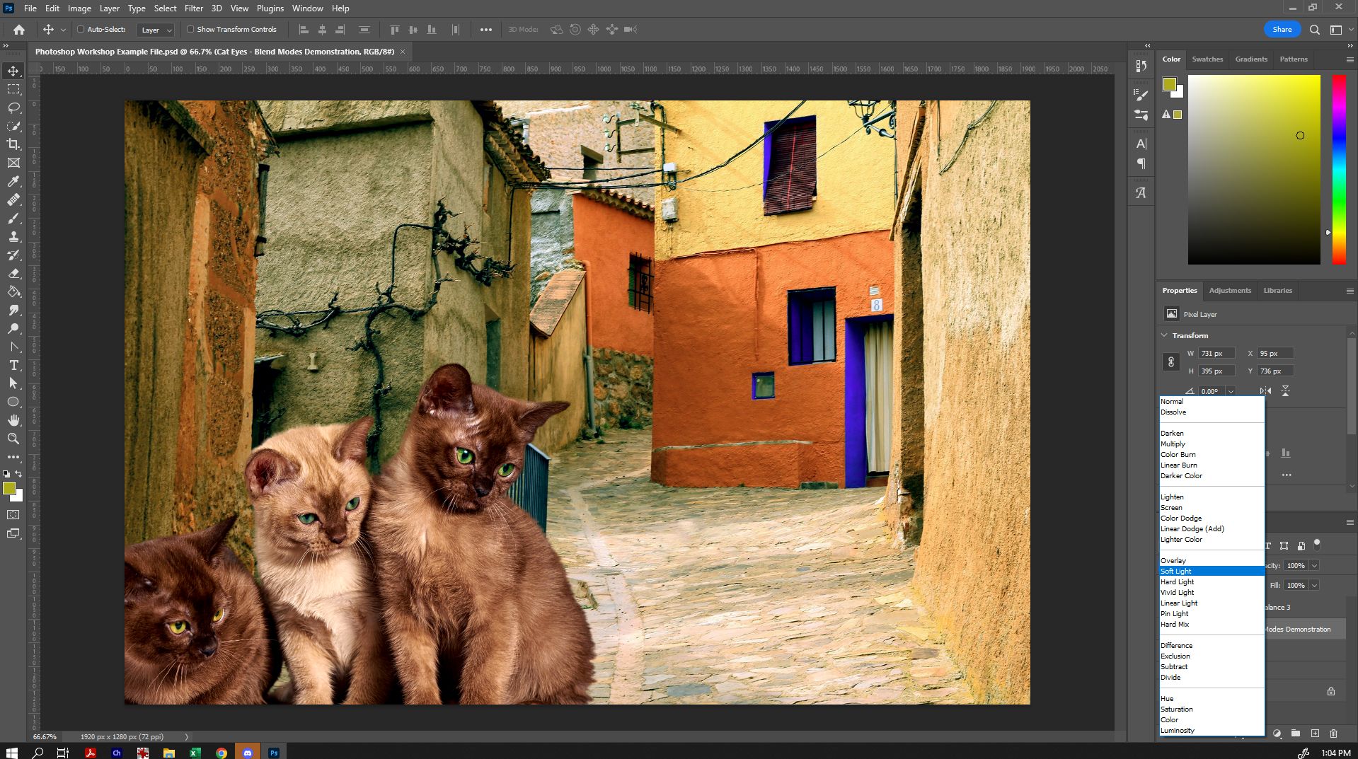
When you're happy with your result, you can stop there, although there is one last touch that can bring everything together nicely - add an additional adjustment layer (or two) on top of everything else to help unify the colours. In my final file, I also created a new layer and painted over the eyes using the paintbrush tool, and then used the 'Soft Light' blend mode on that layer. This made the colours I painted in semi-transparent in a very realistic way over the eyes to make them stand out!
Experiment! Have a play with adding in another photo, or using shapes, the paintbrush and the text-tool to add different elements. Here is an example composite image and the three photos that were used to create it side-by-side:
Saving Your Images (File Formats)
When saving your images, there are a number of formats available, from the standard Photoshop file format, to a number of other raster image types:
- .psd is the standard Photoshop format. When you save in this file format, you can pick up exactly where you left off. This file type can only be read by Photoshop.
- .tif is intended for high quality images with minimal loss of image data. The file format is typically very large as a result. Primarily used for printing.
- .jpg is popular because of its ratio of quality to file size. It uses image compression to pack as much information into the smallest file size, and you can adjust the level of compression within the save options. High quality .jpgs can be used for printing also.
- .png is primarily for screen display. The format also supports transparency.
- .gif is primarily used for screen display. The format also supports transparency. (You can also create animated gifs in Photoshop too!)
When saving your file/s, consider their intended purpose and pick your file type accordingly. It is always recommended that you save a .psd version so that you can go back and make changes should you ever want to, as all other raster file types will 'flatten' all of your layers into one.
Further Resources - Suggestions of where to go from here
Photoshop is a powerful tool, with much to explore. Today, we've looked at the basics of changing colours, editing/retouching and creating simple composites. If you would like to develop additional skills in Photoshop, consider these suggestions:
- Another State Library of Queensland Workshop - Recolouring Vintage Photographs
- If you are interested more in portrait/beauty retouching, search for tutorials on a technique called 'Frequency Separation'. Although a slightly more advanced technique than what we explored here today, a step-by-step guide will give you a great starting point for skin retouching, as it separates out the colour from the texture so that you can edit them independently for a flawless look.
Downloads
Photoshop Example File:
Source Images:
These images have been sourced from https://pixabay.com/ and are CC0 licensed.

